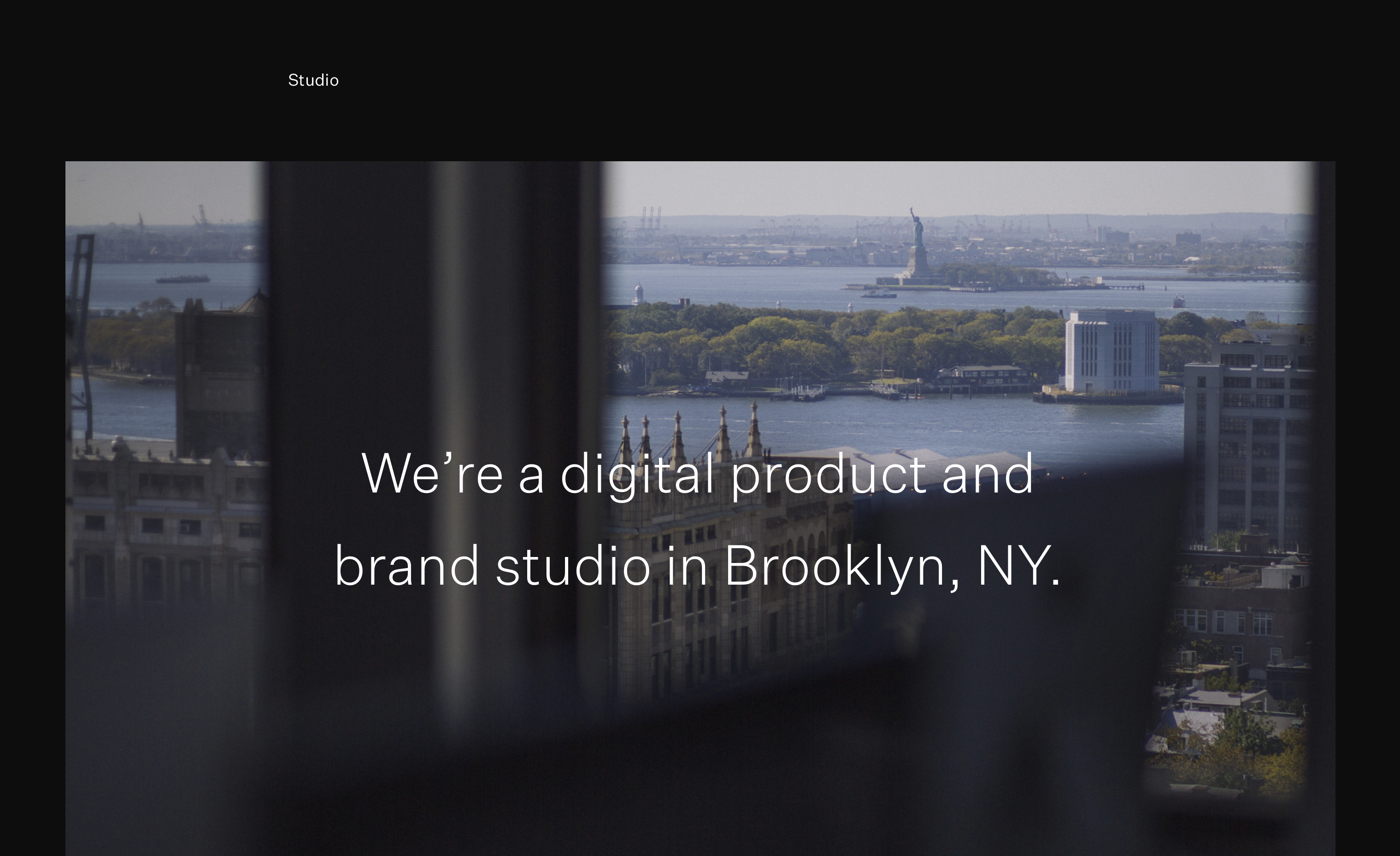
This Also Website Evolution
This Also was a digital product design agency based out of New York City that operated from 2014–2019. As This Also grew and its goals and clientele changed, so did the goals of the website. Each refresh brought new challenges and an opportunity to share a fresh vision of ourselves with the world.
I was an early employee of the studio and worked on nearly every incarnation of the website. My primarily role was as the lead developer but I was involved in design and exploring new ideas as well. Each version was given a codename that evoked the main feature or vibe of the design: Redwood, Magnolia, Whitewater, Spring and Zen.
Redwood
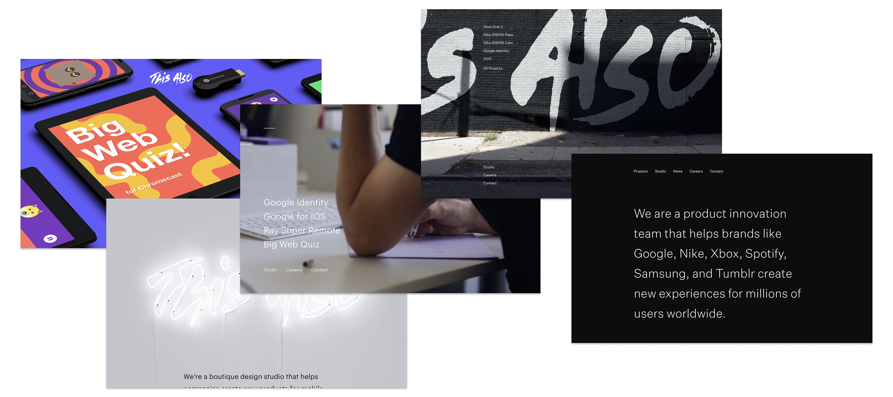
This was the first incarnation of the site that I worked on. It released in mid-2015 and replaced a previous one-pager that consisted only of text introducing the studio. We had exactly one case study to show off so we took the novel approach of making that front and center and then including studio information further down the page.
The top portion of the page featured an array of tablets and phones showcasing screens from Big Web Quiz, a multiplayer quiz game for Google Chromecast that we had worked on with Google Creative Lab. Each device faded in and slid up, one after the other. We engineered the effect to be as smooth as possible which meant that a number of things had to be considered:
- Images loaded in order from top to bottom. An image could not appear until the previous one in the order had.
- Images could not fade in until the asset had been loaded, so that none of them popped in unexpectedly.
- There was a minimum delay between images appearing.
After the case study was a more traditional about us section. One thing we always strove for was balancing simplicity with playful, fun touches. To show off our personality, we created a widget with an image on the left and text on the right. The contents would change each time you refreshed the page and would quickly cycle in a random order when hovering or when pressing a finger down on touch devices. The images were taken from our Instagram page and featured candid shots from around the office, while the text was mostly made up of in-jokes and references.
Magnolia
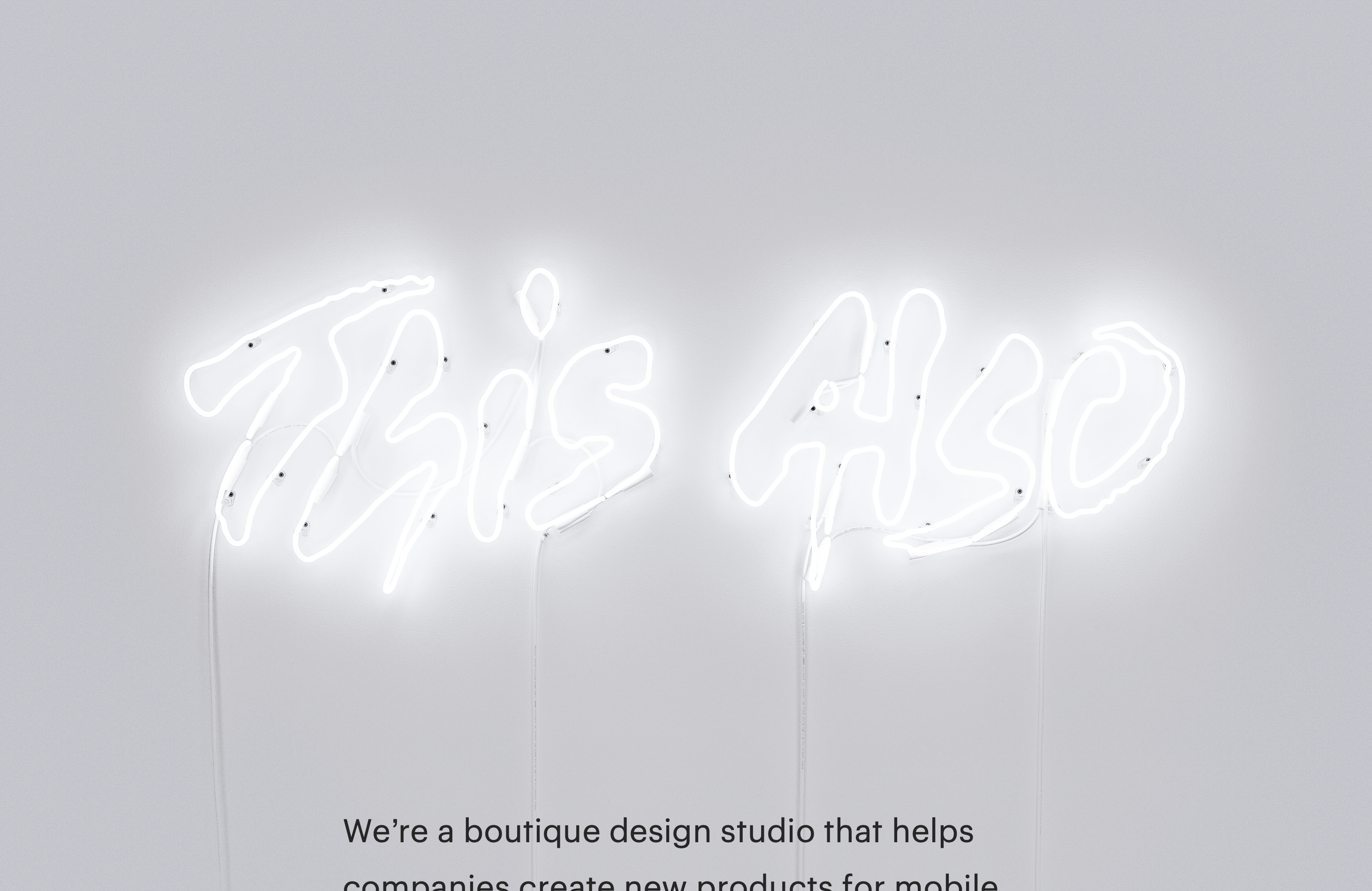
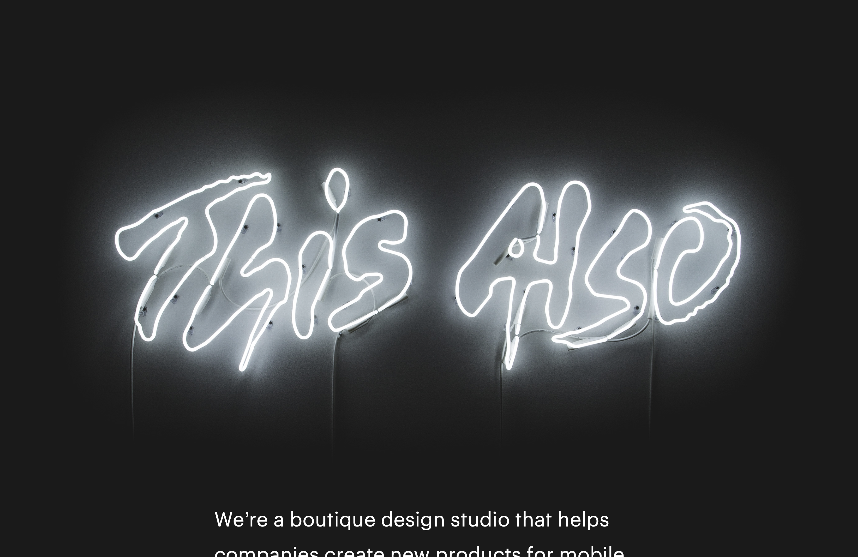
The next version was stripped back and much simpler. It acted as a placeholder that removed the focus from a single case study but didn’t yet have individual pages for other work yet. The main feature was the prominent photo of our logo—installed as a neon sign in our office—in the background. The site loaded either a day or night version of the photo depending on the time of day for the person browsing the site.
Whitewater
We followed up Redwood and Magnolia with the third version of our site in one year, but our most comprehensive, feature-full iteration yet.
The homepage showed a fullscreen background video of b-roll from around the office. In front of that was the site nav. The main gimmick of the site centered around this homepage. Rather than a traditional nav bar, we had a menu button that, when clicked, opened a full-page menu identical to the homepage. Also, by scrolling to the bottom of any page you would reveal that same homepage-menu. The homepage was the grounded anchor of the site and everything led back to it.
We designed multiple states of the menu button as well as page transitions to make the entire site feel like a seamless experience. The button collapsed into a single line on the homepage and when in the footer, transitioned from MENU to HIDE when open, and showed an animated squiggle—dubbed the chillwave—while loading a new page.

Aside
At one point in development we toyed with the idea of the menu button being a 3-dimensional cube, with the different states on each face. We made a paper prototype to determine which side each state needed to live on and what orientation made sense so that the transitions between states would be pleasing 3D rotations.
Mobile Video
When this was released, inline video on mobile web browsers was still very limited. For a long time, video wasn’t able to play inline on smartphone and tablet browsers and trying to start a video would launch a full-screen player. This made that using auto-playing video as a background element was impossible. This limitation would eventually go away but we wanted a solution in that moment.
GIF might seem like an obvious option but the format comes with a lot of baggage. The filesize of a GIF is often larger than that of an equivalent video and the limited color palette of GIF files means that they’re rarely the same quality as a video anyway. On top of that, it’s difficult to programmatically control GIFs via JavaScript so there is no play, pause, or seek functionality, which is a major accessibility issue. In seeking a solution, we found a handful of sites (notably apple.com) which had found a way to emulate video. Taking those ideas as a starting point, I created the Whitewater Video encoder and player, which you can read more about in this article.
Spring & Zen
The final two evolutions were an exercise in stripping back unneeded features and focussing on simplicity and clarity. Case studies were simple and templated, which allowed us to produce them much more quickly than in previous iterations.
Spring kept the concept of the homepage being the navigation menu and revealing in the footer from Whitewater but swapped out the video for a static image. The biggest change between Spring and Zen was the removal of that feature in favor of a traditional nav bar along the top of the page. Both versions kept the animated chillwave element as a loading indicator but removed the menu button.
Bonsai Styleguide
In addition to the site itself, we also published a minimal brand/style guide named Bonsai. This guide laid out the basic tenets of our brand, featured an interactive typography and spacing calculator, and included our rules for clear, inclusive writing.
The core tech stack evolved very little but most of the underlying code was rewritten for each iteration. The site was hosted on Google App Engine using Python. The frontend used jQuery, SASS and Jinja templates. Build processes such as minifying scripts, optimizing images and processing SASS files were handled by Grunt tasks. No CMS was implemented and pages were built entirely in code using reusable templates and modules.