Microsoft Unlocked
Unlocked is an editorial platform where Microsoft shares “stories from the heart & soul of innovation”. I helped to build and launch the site, provided ongoing maintenance, and deployed new features post-launch including one-off experiences for standout stories.
Instrument was involved at nearly all stages of Unlocked including strategy, design system creation, page layouts, editorial writing, photography and videography, development and more. As Associate Technical Director I was involved in lending technical guidance in the earliest stages and leading the engineering team to bring the vision to life. I met with designers and strategists regularly to discuss UX and UI intent and to clarify technical constraints.
As the project continued to evolved I worked to onboard new developers, gave tours of the CMS to internal and external stakeholders and provided further technical guidance. In addition to my director responsibilities I contributed to the codebase directly, building significant features and components myself and guiding the engineering team to execute others.
Engineering Flexible Constraints
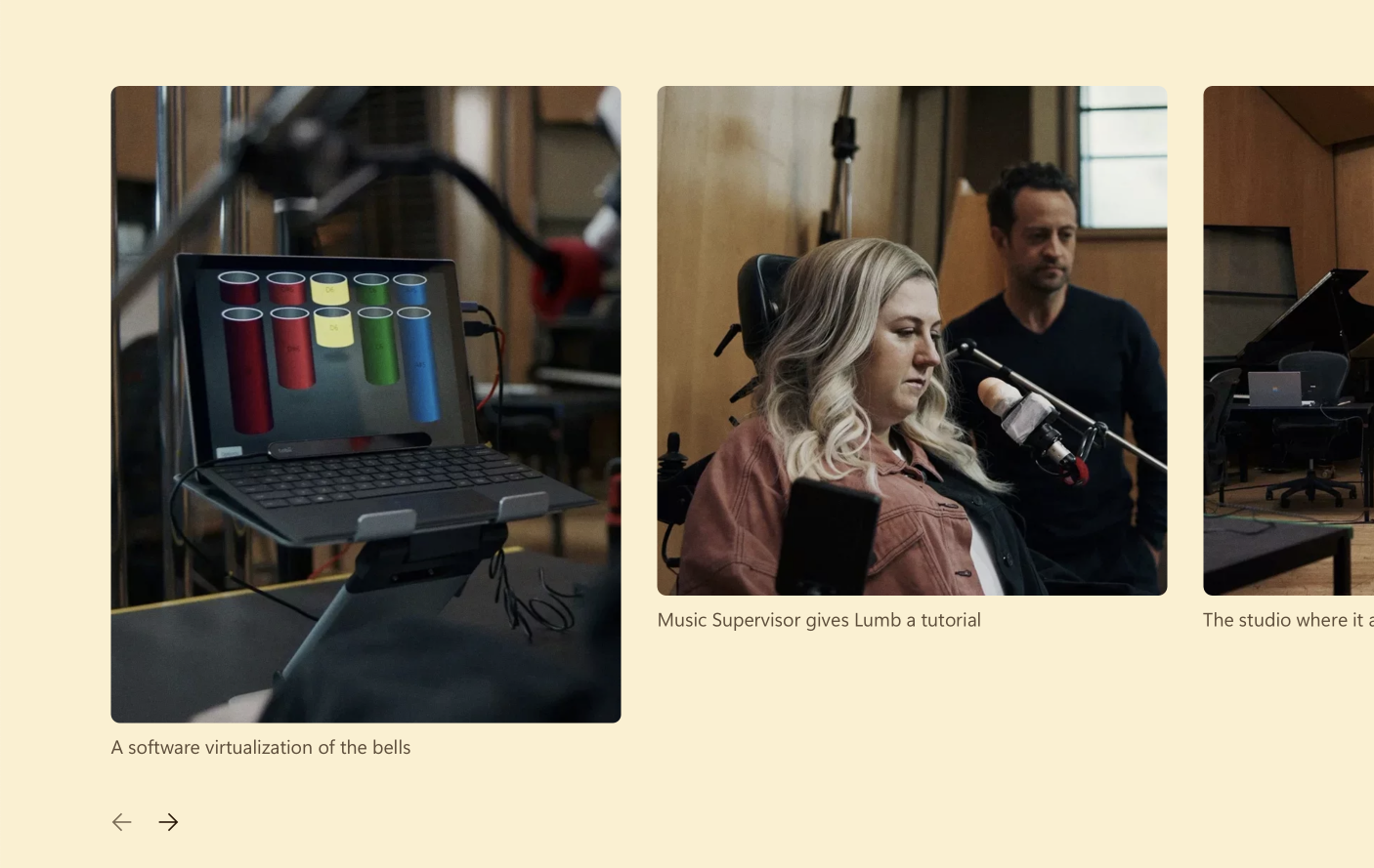
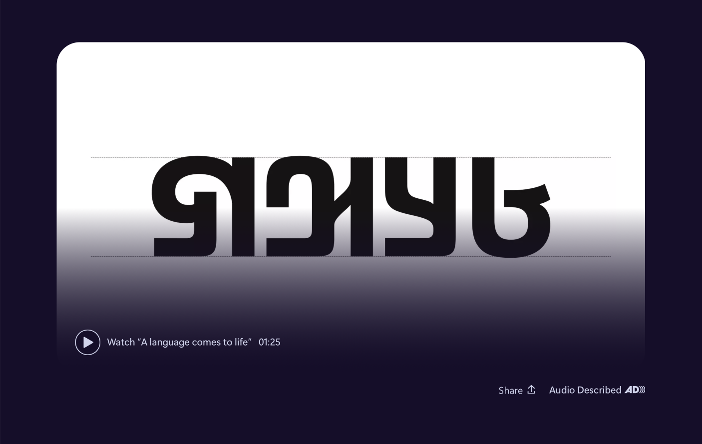
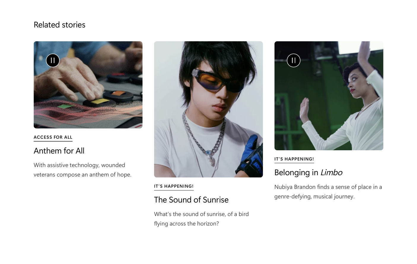
The experience of Unlocked called for a user-friendly CMS and a mix-and-match design system that was flexible enough to make each story on the site stand out with its own look and feel, while preserving a cohesive site-wide design language. To this end, we used WordPress for its visual Gutenberg editor, extensive customization options, and the ease with which it allows non-technical editors to iterate on pages and see their updates in real-time.
In customizing the WordPress experience and creating templates and components, I placed as much emphasis on the usability of the editor interface as I did the polish of the site itself. A key consideration in building the editor was balancing which layout options we presented to page creators and which were hard-coded into the site theme. Each time a new component was proposed I led discussions to answer what the authoring experience should be and how the site and components should adapt to one another.
Technical Implementation
We used ACF Pro to create our custom Gutenberg Blocks. This approach prevented us from having to split our development experience between PHP and React and allowed us to share code between internal dev-only components and user-facing blocks.
About Gutenberg Blocks
By default, Gutenberg blocks are built using React. When a page is saved, the resulting HTML markup is saved directly to the page’s content field in the CMS. No React runs on the user-facing site. Since the result is saved statically, any change to the component in the future is not retroactively reflected in already-published instances.
Gutenberg also offers dynamic blocks, which still feature a React editor interface but pass data to a PHP script to be server-rendered (like traditional PHP). This approach results in either losing some features of the editor or having to build your component twice: once for the editor in React and again for the live site in PHP.
ACF Pro bridges these approaches by creating dynamic blocks that show a live preview in the editor with a separate editor UI built using familiar ACF fields.
We eschewed the built-in blocks for a set of fully custom ones that gave our design team more control over the appearance and functionality of each component and allowed us to easily tie every element into our dynamic theming system. For this same reason, we avoided WordPress plugins that add their own blocks.
To streamline the developer experience and ensure a consistent environment between team members we used Local as our development environment, Composer for managing and tracking WordPress plugins in Git, and webpack to process and bundle the assets which made up our custom theme. I created Bash scripts to import content from production or staging into the local environment and set up a CI/CD pipeline through GitHub Actions to streamline deployment to our environments.
Flexible Theming
Important to the design philosophy was giving editors a large toy box to create pages that allowed for a lot of freedom while maintaining a cohesive brand identity. Theming ranged from color combinations to page layouts to font choices. I worked with stakeholders to identify which aspects of the site theme needed to be enforced by the editor itself versus which should be editor-options.
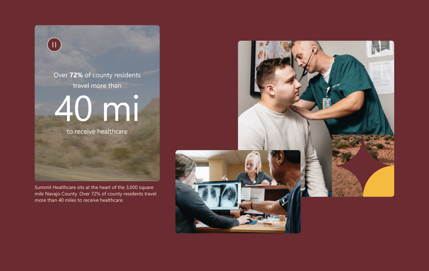
The most obvious aspect of the theme system was color-combinations. Dozens of themes were created, each consisting of a palette of colors for text, backgrounds, buttons and other elements. Each was vetted and individually tweaked to meet accessibility color contrast guidelines.
Every page is assigned an initial theme. Two separate theme-switcher components were created which allows that theme to be changed mid-page. The first was a static theme switcher, which wrapped components in a sub-theme and created a hard transition. The second was a dynamic theme switcher which triggers an animated theme transition for the entire page after a user scrolls past that point.
We defined the site’s color palette as SCSS variables and passed those through as contextually-named CSS variables, defined by their usage, which could be redefined mid-page to set and switch themes at any level by applying a data-theme HTML attribute with the theme name. This allowed us to use semantically appropriate names within components that never had to consider the actual color that would be applied, and which made the switching of themes a global concern rather than a per-component one.
/* Define base colors */
$white: #ffffff;
$black: #000000;
$gray-light: #f0f0f0;
$gray-dark: #101010;
/* Define themes */
[data-theme="example1"]
--theme-text: $black;
--theme-text-secondary: $gray-dark;
--theme-background: $white;
}
[data-theme="example2"] {
--theme-text: $white;
--theme-text-secondary: $gray-light;
--theme-background: $black;
}
/* Use named variables for components and elements */
body {
color: var(--theme-text);
background: var(--theme-background);
}
.secondary {
color: var(--theme-text-secondary);
}Accessibility
Microsoft has a wonderful internal accessibility team who we collaborated with to ensure the site met not only industry standards, but Microsoft’s own high bar for inclusivity and usability. I had regular meetings with their team to present concepts and submit in-progress work for review, and worked closely with them to validate solutions.
Unlocked features heavy use of small, looping video clips. I developed a robust system to ensure these performed well (auto-pausing when off-screen), featured on-screen controls when required, and respected user-preferences for motion. The prefers-reduced-motion setting is respected across custom components as well, sometimes requiring secondary designs or transition states for when the option is enabled.
Additionally, I ensured each component and color-theme supported prefers-contrast, prefers-reduced-transparency and forced-colors options. For the former two, themes were defined with a higher-contrast variant of the color combinations, gradient shims on media elements were darkened and extended, and transparent backgrounds were made solid. Each component was individually audited with the forced colors setting enabled to ensure they used the correct named system colors and overrides were applied where necessary.

forced-colors enabled Bespoke Experiences
For larger, high-priority stories, we were often asked to envision, design and build special experiences to be embedded on the page. These ranged from variations on interactive slideshows to quizzes to a custom WebGL audio-visualizer.
Each was treated as its own separate project and often had to balance time and budget across multiple disciplines, which meant sometimes trading budget for development in favor of video production or vice versa. In many of these cases the stories were being researched and written at the same time that the page was being designed. This required an aggressively flexible approach from conception through launch to allow for rapid reprioritization and which often included many 11th hour changes.